Sunday 29 November 2009

CONSTRUCTION - Photoshoot for the Album cover

DOING THE PHOTO SHOOT FOR THE ALBUM COVER AND PICKING AN IMAGE

Today we did the photo shoot so we could pick an album cover image. We decided that we wouldn't want any props in the photo and that we would like just a straight forward beauty shot of her face. We used a lamp to create lighting and played around with the lighting in order to find the best way we could take a good photo. We tried taking some photos with the flash on the camera but decided that they didn't look as good as those without. We decided that the emotions on her face would be quite sultry because this fitted with the genre and music of the song for our video.
As we didn't have professional equipment like a proper backdrop, proper lighting, etc we came across many problems. We had many issues with the lighting as it didn't work out as well as we'd hoped, but we are going to edit the photo's using photo editing software Photo Shop, which I have, to make the pictures look better.


However, we had to make do with the resources we had, and decided to use a plain white wall as the backdrop so we didn't get any unwanted things in the image, this also means that we can easily change the colour of the background on photo shop as it's already plain. We had the luxury of being able to use Jack's really good Cannon Digital SLR camera, as it took very high quality photo's, so this would make the album cover look more professional.Also in a few photo's we used a green screen as this would make it easy to change the background all one colour.


Here are all the photo's we took, which are unedited and straight off the camera:


After carefully looking through all these images, we have narrowed it down to 4 that we like and we have edited them using Photo Shop in various ways and using various effects to make them look better.


Here are the before and after shots of the photos that we have chosen:


1) Before - Original Photo.


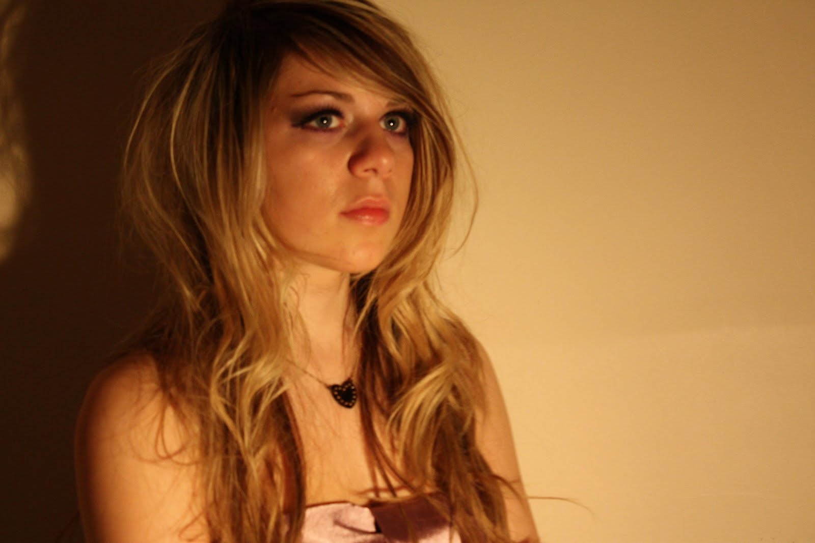
1)
After - Edited Versions.


Changed the contrast and Lighting, so emphasized the shadow behind her. Decided to try this photo in Black & White so see what it looks like. However, we think that it looks a little bit plain.


In this version we have done the same as above, made the contrast more harsh and changed the lighting so it looks better. We really like the version as we like the contrast of the background between the black shadow and the yellow light.


2) Before - Original Version.


2) After - Edited Versions


Same as below, except just did a black and white version.


On both of these photos i added an artificial lightening effect on Photo Shop so it looks like only half her face is lit up. As you can see from the original we didn't get this effect with real lighting, so I had to do it with an effect.


3) Before - Original Photo.


3) After - Edited Version.


In this version, did the same as the first.


In this version we have tried something different by putting her image on the right hand side with a black background. This could be a possible image for the BACK of the album cover, as now there is adequate space of the track listing to go.


Here is a photo that we took when filming before which we are considering using:


The next thing that we are going to do is pick the final image for the back and the final image for the front cover and then start working on the font which the album name and artist name is going to be written in, and also what is going to be on the back of the album also.

Monday 23 November 2009

PLANNING - ALBUM COVER

THINKING ABOUT IDEAS FOR OUR ALBUM COVER

Taking into account the research that we've done on album covers (particularly the covers of Leona Lewis, Beyonce and Taylor Swift) we found that the album cover is often a reflection of the music contained on the album. For example, if it's a album containing soft pop songs, the cover will usually be very emotional to fit the mood of the songs.

I also felt that it was important to ask people what they expected to see in a CD cover for this genre of music and i generally found that people expected to see things like a close-up beauty shot of the artists face, album name and artist name, and tracklisting on the back.


Here is the layout of the CD Digipak that we are going to design. We will do the back cover, which will have track listings. We will do the front cover, with the artist and album name. We will do the inside left which will have an image of the artist on it and the inside right (underneath the CD) will have an image on it, but we are thinking it won't be of the artist it will be on an object (like a candle)


We've decided that as our music video and its song is quite emotional, to fit with the video our album digipak would also have to evoke the same emotions as the video, therefore being a striking image. We have decided that we would like to have the actress we used in the video featured on our album cover as this is often seen on many album covers.


We have been gathering some ideas and doing some sketches of possible designs of our album digipak. We will do a separate photo shoot just for the album cover would be a good idea, as most album covers are from photo shoots, carefully planned out so we will follow conventions.

Some of these idea's are:

  • Having a simple close-up shot of her face, with an emotional expression (like Leona Lewis or Beyonce's Covers)
  • Having her holding a candle, like she does in the video, wearing one of the same dresses in the video (possibly the white dress) and the same hair and make-up.
  • Having a spot light on her.

We don't want to over complicate the Album Cover, as we think that a simple idea will work best with the song and the genre of music, for example, animated album covers would not fit the genre of the music. An emotion evoking image would be much more effective when portraying the mood of the music and the song.

Here are some sketches of possible photo's that we are going to take on our photo shoot which we have organized:

When we get to do the actual photo shoot, we will try different angles of each shot, as each idea is just a rough idea that we are going to play around with on the actual day of the photo shoot.


This is a shot of her sitting in the corner of a room with the light only on her.


Here is a close up of her holding a candle. The background will be just black and the candle will illuminate her face. We will do this without the candle also.


We are also thinking about using screen shots from our video as the album cover as this is also seen sometimes, and this will make sure that the right emotions are evoked as the picture is taken straight from the video.


Here are some possible screen shots that we have decided that we could use:


These are the sort of images that we are looking to capture in our photo shoot. We may try to recreate some of these images, as it would be better to do them again as proper photos instead of just screen shots.

As for the back and inside front of the digipak these will also contain similar images as we want all of them to follow on from eachother and to relate, so we don't confuse the audience. None of them are going to be complicated and they will allow follow the same colour scheme.

Another aspect of the Album cover that's important is the font that the title and artists name is written in. As we are opting for a simple album cover, all it's going to have on it is the image and the title, so it needs to be chosen carefully otherwise it will look ot of place.


Here are some examples where the font choices on these album covers work very well:


This album "Riot" is a fast paced rock album by the band Paramore. The use of a quite rough font helps portray what the album is going to be like, and also fits the title "Riot" which obviously is a negative word. The fact that it's written in capitals shows this too. The font choice really reflects the music also as it makes me think of "aggression" and fits with the cover well.


This font use really contrasts with the above one. This album by 'Leona Lewis mainly contains soft love songs, and the font 'Spirit' is very soft and reflects the album name and the songs on the album and fits well with the album image of her looking very soft and feminine. The use of the Calligraphy font is very good at portraying softness and is a very feminine font, apposed to print type fonts.


Together, we all chose a few different fonts that we believed would work quite well, after we have done the photo shoot and chosen our final photo, we will decide on the font that will fit best.
Here are the fonts that we like (I've used the words of the song title "cosmic love" to show the font):


Another very important factor is the Album name itself. The album name also very much reflects the music on the album. As above "spirit" would suggest soft, love very soulful songs. Whereas "Riot!" would definitely suggest a very progressive, more up tempo sound.
We are going to start thinking of a suitable, "soft" album name that will fit with the album image.

We have planned the photo shoot date for Sunday the 29th of November, and have thought about the advert also, we are not going to do a separate shoot for the advert as we are going to use the image of the album cover in the advert.

Thursday 19 November 2009

FINISHED - PROMO MUSIC VIDEO

THE FINISHED MUSIC VIDEO


Here is the final version!
I added in some annotations in red just so you can see which bits we have clearly changed since the last draft!

In our music video, I believe that we have followed many conventions that are present in professional music videos. For one, we used stereotypical representations of women being very emotional and affected by love. We also used stereotypical female clothing such as the pretty dresses, and styled her hair and did her make-up in a very feminine way. However, we steered clear of sexual representations women as "sexy" which many music videos do.

We used a variety of different shot types and effects throughout the whole video, which are usually seen in music videos as this makes them more interesting. We use conventions from typical love songs in many ways due to our research. For example, we used typical black and white effects which makes things more emotional (as seen in Beyonce's video Broken Hearted Girl) as the colour is taken out it reinforces the negative emotions. We also used slow motion and fade and dissolves which are typically seen in love song music videos.

Wednesday 18 November 2009

EDITING - FINAL VERSION

EDITING TO FORM THE FINAL VERSION OF OUR MUSIC VIDEO

After filming the last of the corrections we needed, we edited these into the previous draft to form a final version of the music video.
We laid a few more shots over the existing shots just to make the original shots more interesting.
This draft didn't differ much from the previous one, but as feedback suggested, people didn't like the running shots as they thought they went on too long and when asked what would make them better, they said if another shot was with them, so we took this into account.


CONSTRUCTION - More Filming and Editing

CORRECTING THE SECOND DRAFT TO MAKE A FINAL DRAFT


We decided that we would do more a little bit more filming, just to correct some negative points we heard from the feedback of our second draft.


  • Firstly, as the people didn't really like the side shots of her running, as they thought they were as good as the rest we decided to shoot a few more shots of her lying down on the mysterious person, to layer them over the top to make them more interesting, as this is what people thought would make it better.


  • We also got an idea from our teacher that we should film a firework (cathering wheel), which we did. However, this wasn't as successful as we thought because the firework lit up the fence and this didn't look very good as we didn't want a massive fence in the background. But, we used about 2 seconds of the catherine wheel, but only the bit where you couldn't see the fence, which gave a good effect.

  • We also added in another close up shot, as people wanted this type of shot more often. Also we filmed a few more shadows as people liked the shadows idea.


  • After we filmed these last shots, we edited them over the bits that people thought weren't as good as the rest.


Tuesday 17 November 2009

FEEDBACK - Asking people about second draft

GETTING FEEDBACK FOR OUR SECOND DRAFT AFTER APPLYING OUR CRITICISM FROM BEFORE

Today we showed around 60 people our video (not in our class, so they hadn't seen the first draft.) and their ages ranged from between 11-18, to gain feedback for our second draft.

This time round we gained much more positive feedback, mainly on the same things as before.

People liked the layering shots, and the fact that the shots built up as the song got faster and more layered shots were added. Also, people loved the use of our good shot variety, and particularly loved the close-up of the eyes. Also people liked the fades and the use of shadows, and the ring scene and how these all fitted well with the genre of the song, like many videos of the type they have seen before.

HOWEVER, a lot of negative feedback centered around the sideways running shot, which people didn't seem to like very much. Because of this, we are going to rethink using this shot, and might replace it with something else.


Monday 16 November 2009

EDITING - To form a second draft

EDITING ANOTHER DRAFT INCLUDING OUR NEW SHOTS


Today we all got together at Jack's house, using his editing software to create another draft.

We decided that, as during the feedback, people seemed to love the idea of all the shots layered on top of eachother, we would definitely keep this going throughout the video.
Here is an example of a layered shot that we used, which is quite simple and only two images layered on top of one another.


Also, we put some blue affects on some of the shots as it makes them look slightly more emotional and intense. We also put the running shots in slow motion as we believed this captured the emotion and fitted with the pace of the song better. Here is an example of a blue tinged shot we used.


As the beginning of the song starts off quite slow we used a gentler pace for the editing and as soon as the drums kicked it and the beat got more intense we started to use faster paced editing to help convey the mood of the music. As the song got faster more shots would be appearing and fading in and out and more would be layered compared to the beginning, showing the build up. Here is an example, because you can see 3 shots layered on top compared to only the 2 above, in some shots we used 4 layers. However, at one point there a verse goes back to being a slow, so we once again slowed down the pace of the editing, then made it faster once the song sped up again.
We also made the shots of the ring dropping, and the shots of her embracing the mysterious male character black and white as this helped show the emotion of the moment being captured, enforcing the idea of darkness.

We decided to completely get rid of the bridge pond scene as it was clear from our feedback that it was not working, and people just didn't like these shots, as it didn't fit with the song and rest of the video. During our editing stage, we played around with different effects, but ultimately we predominantly used layering of shots as we loved this effect, and so did people from our feedback.

Here is an example of one shot fading into another. We used this effect instead of just cutting straight to another shot as it softens the feel and fits with the pace of the music.


Here is the second draft of our music video in full :
(insert second draft)


The next thing we are going to do it get feedback on this SECOND draft, film neccesary imporvements, and then work on our final draft.

Sunday 15 November 2009

CONSTRUCTION - Refilming on the basis of our feedback

RE-FILMING THE SHOTS THAT DIDN'T WORK AND FILMING NEW SHOTS

Today we filmed some more for our music video due to the feedback we received from our first draft. We waited until late because once again, we needed it to be dark before we filmed because criticism that we received was that our day time shots didn't fit in with the rest.
We got all the equipment that we brought with us last time including the tripod and video camera, a normal camera to take photo's of the process, our board to create the wind in the hair, the costume etc. Out location was Jack's street.
(image)

Continuity wasn't important as we have had her wearing different clothing in each different location, so we had her again wearing a different dress, and this would not confuse the audience as it's a different location.We had her wearing another white dress as we liked the symbolism of her being feminine and emotional.

When we were in the planning stage of our video and were brainstorming, it was mentioned that we would film in A STREET.

However, when we finished filming before editing the first draft we thought that we didn't need the street scene, but after our feedback we thought it would be good to include it now. So our location was Jack's street, being a cul-de-sac it wasn't busy and we didn't come across any problems or complications.

We decided to draw out a rough storyboard of some idea's for our street scene:

We took into account that we needed more of a variety of shots, as we received this criticism, so we focused on getting some close up's and mid close up's as this is what we were lacking in. After we did this we decided that we would film her running down the street away from the car so she ran in front of the car as we filmed out the sun roof, and did it the same reversing so she was running towards the camera. We also got some sideways shots of her running as she thought this would vary the shots a lot.

We also decided to include the shots of her in an embrace with a "mysterious" person, who's identity was unknown as they were not the important person in the video, we didn't feel it was important that we were in the video a lot, and also had the idea of her dropping the ring.

Overall we felt that this was very successful after looking back on all the different shots we felt that this was exactly what we needed in order to make it better, which is why we were very dependent on the criticism to help us. The next stage for us is to edit another draft, and once again get feedback so we can move onto a final draft.


Here are some photo's from this day of filming:

(add photos)

Wednesday 11 November 2009

FEEDBACK - Asking out class what they think

GETTING FEEDBACK FROM OUR CLASS TO DECIDE WHAT ELSE NEEDS TO BE DONE


We decided that it would be a good idea to show our rough draft to our Media Class to get positive and negative feedback as to what was working well and what didn't look too good.

POSITIVE
  • Most people agreed that the overall idea of the music video was a good one, mainly because it fits the genre of the song we chose really well. So this gave us confidence that our idea works well and that we wouldn't have to do any major changes.
  • Something that mostly everyone agreed on that they thought was really effective was our use of fading images and layering different shots over eachother. They found that this accentuates the emotion of the music and fits well with the song as it gives a soft feel. This made us decide that we would add in more of these types of shots when we come to do another, longer draft of our music video.
  • People gave us feedback that the Editing was good, as it fitted the pace of the song. We found that people liked the use of dissolves when changing shots as it fitted in with the music, which we felt also worked well.
  • Someone said that they thought that our suttle interpretations of the lyrics worked well, for example, when the lyric goes "I was on the edge of darkness" We have her on the edge of the spotlight. Also people liked that we didn't take the lyrics too seriously and made them too literal.
  • People liked that we put the close up of the "ghostly face" behind the walking shot, but we were told it wasn't too clear and we should make it clearer.


NEGATIVE
  • Mostly all our negative feedback surrounded the pond shots that we had filmed. We found that people agreed that it doesn't work well, mainly due to the fact that all the other shots were filmed at night where the back-light was dark, however shots in this location were filmed in the day. People told us that it just didn't follow on well enough and didn't look good in the sequence that we placed it in as it just jumped from night to day.
  • We got a few mixed reviews on the acting in our music video, even though most people agreed that the acting was very good, some people said that the acting should have been a bit more exaggerated.
  • We got feedback that most of the shots we had filmed appeared to be either long or mid shots. Some people said that we needed some more variety as we didn't have many close up shots, which we agreed with. Especially the walking shot, as people felt this was too long and needed to be replaced with a mixture of close ups and long shots as she walked.

The feedback was very useful to us as it just reinforced what we felt wasn't working very well, and as we got exactly the same feedback from out class as what we thought, we knew what we had to change. Also our class has people from ages 17-19 which are part of our target audience, so it's good to see that they understand our idea and like it.


Overall, from this draft, we have concluded that we must do some more filming in order to make our film better than it is. Changes that we are going to make are that we may film the pond scene at night so it fits in with the rest of the film. Re-film in our locations a wider variety of shots and re-think our shot order when editing again.


We have decided that we are going to do this on Sunday as our group and our actress are all free to film. We will also take pictures for out Album cover that day.